Graph a web-HUMAN simulation in Excel
I. In web-HUMAN
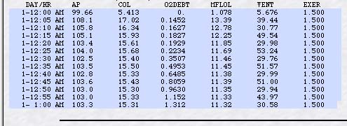
- Select (highlight) the data table (see figure below)
of the HUMAN output without the headers (i.e. do not
highlight the line DAY/HR etc.)
- From the Edit menu select Copy.
II. In Excel
Open an Excel worksheet.
From Edit, Paste (all of the data appears in the first cell of the worksheet).
Under the Data menu, select text to columns, make sure "Fixed width" is chosen and click Next.
Step 2 - Follow instructions to separate the data into appropriate columns then click Next.
Step 3, click Finish. (your web-HUMAN data is now in Excel).
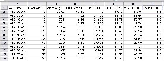
To add a row of column headers [e.g.Day/Time, AP(mmhg), etc. ]
- click on row 1 (extreme left) and from the Insert menu pick Rows (this empties the top row making room for column headers).
- Type your column headers into the new row 1 (see figure below).
To insert a time column (see B below)
- Highlight Column B (AP) (click at its top) and from the Insert menu pick Columns. Type into the new column B the time of the experiment in minutes, for example: 0, 5, 10, 50, 20, . . .60 .
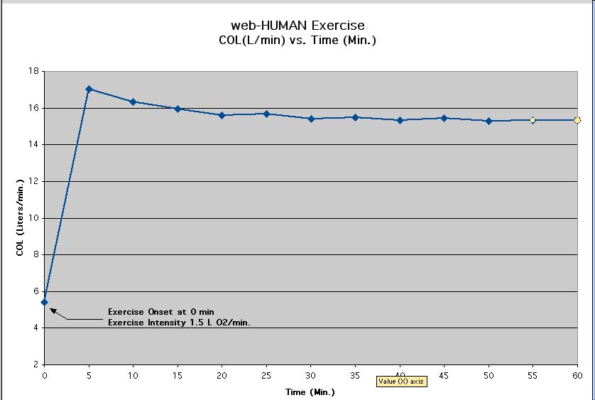
III. To Graph the data
- Select the newly created time column and the column for the variable to be graphed. (To select non-contiguous columns select one and hold down the Ctrl key (Mac- Apple key) and click on the second)
- Under Insert menu, select Chart.
- Select XY Scatter with connected points (& click Next)
- Select Series in columns, check that the preview graph makes sense. (& click Next)
- Chart title should identify the graph contents. Enter appropriate axes titles (including units of measurement.) Click away "Show legend" for economy of space.(& click Next).
- Place Chart as a new sheet. (& click Finish)
- Make final editing changes before printing. The final graph is shown below.