 |
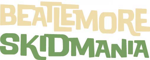
| Beatlemore 2012's Artist: Joe Klockowski '14 |
| Interviewed by Samantha Hoffmann '13 |
| |
| Now that you’ve all survived Moorebid Ball, it’s finally time to turn your attention to bigger and better things: Beatlemore Skidmania 2012! This year, 17 acts will perform in the Arthur Zankel Music Center Friday, November 16, at 8 p.m. and Saturday, November 17 at 2 p.m. and 8 p.m. While you’ve all been fretting about your Halloween costumes, a few students and faculty have been putting things into motion to make this an incredible event. One of these students is Joe Klockowski ’14, a member of Deb Hall’s Communication Design class, and the designer of this year’s winning Beatlemore poster and t-shirt. I sat down with Joe to talk about the designing process for this year’s poster focused on the 50th anniversary of the Beatles’ first recording. |
| |
| Samantha Hoffmann: What kind of background do you have in graphic design? |
| Joe Klockowski: I’m an art major. I originally started doing more traditional stuff, drawing and painting. I got into Comm Design just to kind of try out the class because I figured it’d be good to learn computer stuff, and I ended up liking it a lot. I plan on concentrating in it now…I like how there’s more problem solving, rather than painting that’s more free form. I like having those parameters – makes it more challenging. |
| |
| SH: Do you have any personal connection to the Beatles? |
| JK: I grew up listening to them. I tend to listen to more of their more psychedelic stuff, but I love all of it. Everyone loves all of it. It was nice because it was kind of like a revisiting of them in class. I feel like I had listened to the Beatles so much throughout my life that it became something I took for granted and phased out of…It was nice to get back into that mode by playing Beatles music throughout class. |
| |
| SH: Tell me about the process that went into designing the poster. Did you have any ideas before Gordon came in to talk with the class? |
| JK: I’m pretty sure a lot of people had ideas. Everyone wants to go the psychedelic path, because it’s more fun to just go wild and it’s actually a lot easier. I mean, a lot of people think of the Beatles as psychedelic – Yellow Submarine is huge…So when Gordon came in – 1962. It wasn’t something a lot of us knew much about, and not many people associate the Beatles with that era…It turned out to be a lot more challenging this way, which was good. |
| |
| SH: How much research, then, went into this concept of the Beatles in 1962? |
| JK: Basically the first day after Gordon came in, everyone in the class just went crazy – Google searched 1962 – James Bond, Dr. No, Alfred Hitchcock – just any influence we could find, printed it out, and tacked in on the wall. That wall was covered in just an overwhelming amount of inspiration. Not only images, but fonts from that era as well. |
| |
| SH: Did you find yourself changing and evolving your concept along the way? |
| JK: I started with wanting to do the suits. I feel like that’s an easier association for people with the early Beatles. It’s that minimal style…The silhouette is from James Bond, very similar to that style. I just kept developing it, and it changed quite a bit…I had three completely different designs I went through as well. |
| |
| SH: What separated this assignment from other ones for the Communication Design class? |
| JK: I think it’s a great assignment. It helps you get a real world, client-directed experience. It’s a lot different designing when you have content you have to fit to. It was cool hearing his [Gordon’s] reaction, someone who might have a very different opinion than a designer, and having to adapt to that. |
| |
| SH: All in all, how would you sum up the Beatlemore poster/t-shirt design experience? |
| JK: It was a lot of work. Everyone in the class stayed ridiculous amounts of hours…Everyone went full force, and there were some really fantastic designs. Overall it was a fantastic opportunity. |
| |
|
14 November, 2012
|