
Typography
The Skidmore College type family brings our voice to life.
When it’s used thoughtfully, typography is a powerful brand tool that can reflect or expand on the meaning of what’s communicated. Skidmore’s typography is clear, clean, and fl exible for a wide range of situations.
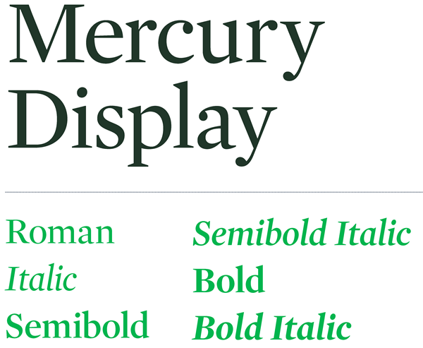
SERIF TYPEFACE
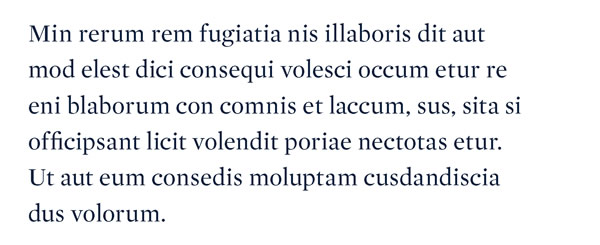
Skidmore’s serif typeface is Mercury Display.
It feels both contemporary and classic, and we use it for headlines, subheads, and callouts.
When creating materials that will be displayed on computers that don’t have these fonts, replace Mercury Display with Georgia.
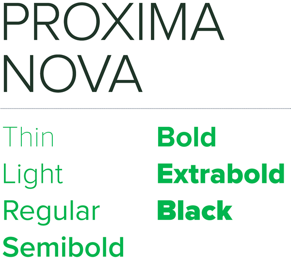
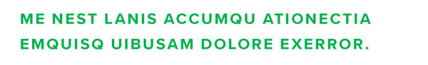
SANS-SERIF TYPEFACE
Skidmore’s sans-serif typeface is Proxima Nova. We use this modern, clean set of fonts for subheads and body copy, and in any instance where legibility is a concern.
When creating materials that will be displayed on computers that don’t have
these fonts, replace Proxima Nova with Arial.
STYLE
Proxima Nova can be used in a variety of weights, in either all caps or lowercase.
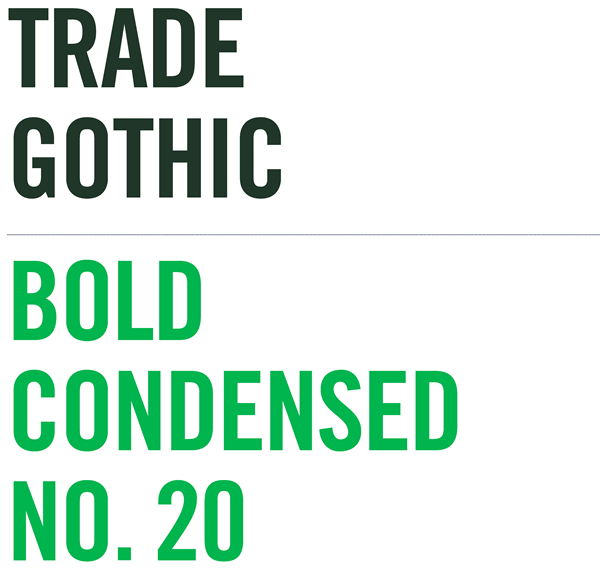
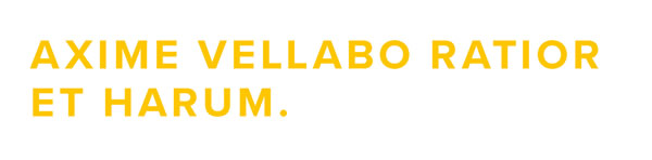
DISPLAY TYPEFACE
Skidmore’s display typeface is Trade Gothic Condensed No. 20. This is a strong, bold font that can be used for subheads, numerals, and callouts.
Always set Trade Gothic in all caps
and use it for short lines of copy. Never use it for body copy.
When creating materials that will be displayed on computers that don’t have these fonts, replace Trade Gothic with Impact.
STYLE
Trade Gothic Condensed No. 20 should be used only in its Bold Condensed weight, and always in all caps.
PROPER LETTER SPACING
Trade Gothic Condensed No. 20 default kerning is a bit tightened up. When typesetting headlines or large type, set tracking to approximately –20 points.
TYPE TREATMENTS
No matter who your audience is, a typographic hierarchy should guide the reader easily through the content. You can achieve this through size, style, color, and contrast, all of which help inform the reader about what content to pay attention to first. Use the example shown here as one possible starting point.
Mercury Display Semibold
Size: 48–64 pt.
Kerning: Optical
Tracking: 0
Proxima Nova Bold
Size: 12–18 pt.
Kerning: Optical
Tracking: 100–160 pts
Mercury Display Roman
Size: 9–10 pt.
Kerning: Optical
Tracking: 0
Proxima Nova Bold
Size: 8–14 pt.
Kerning: Optical
Tracking: 100–160 pts
LEADING
Line spacing, called leading, should be set tight, but not too tight. In most cases, try leading that’s 2 points higher than the type point size.
TRACKING
Letter spacing, called tracking, should always be set slightly tighter than the default setting, and optical kerning should be used when it’s available.