
Events
Campus and Regional Events
Apr29
Apr30
May09
Jun08
More
Campus and Regional Events
Scenes of campus life at Skidmore
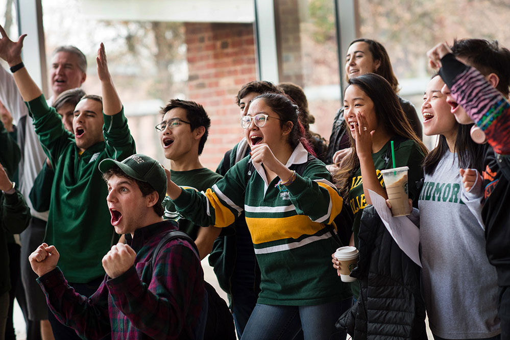
Welcome, Skidmore 2028!
Information & Resources
Why Skidmore?
We're a dynamic community where Creative Thought Matters in every pursuit.
Coming soon
A ground-breaking project and a holistic approach to student health and wellness.
Creative Thought Works
See how the liberal arts differentiate our alumni every day, in every field, around
the world.
Featured News
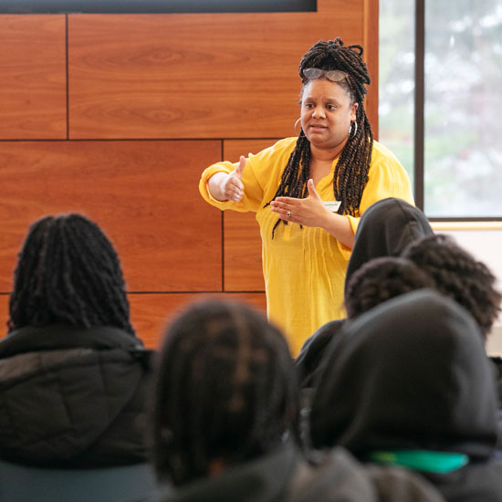 The Skidmore Opportunity Program’s director discusses how OP listens to students' needs and helps them grow and thrive.
 The College is joining 60 other college presidents of diverse institutions from across the country to advance higher education’s pivotal role in preparing students to be engaged citizens and to uphold free expression on campus.
 An abundance of lectures, performances, and athletic events has campus buzzing about a spring semester that is truly difficult to eclipse.
Creative
Thought
Matters
Thought
Matters
We believe that every life is made more profound with creativity at its core.
Read More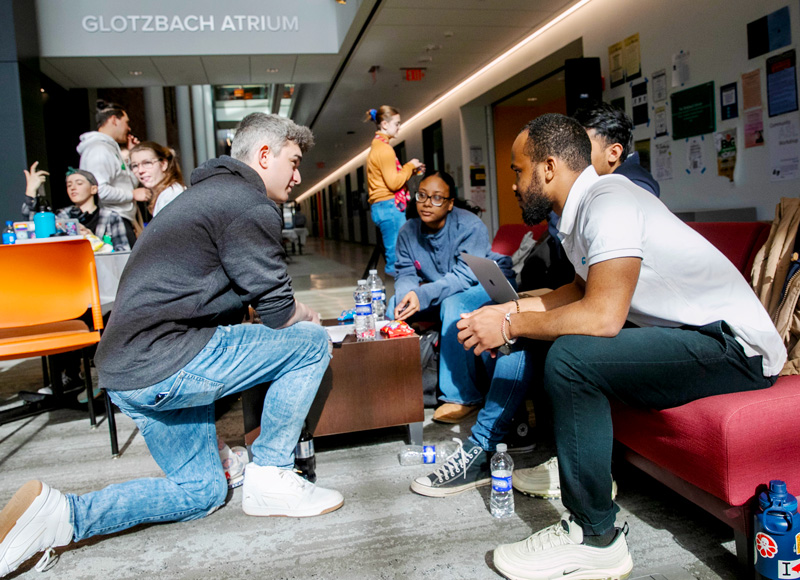
Curriculum
No matter what discipline you pursue, you'll look at it from every angle, connecting
different modes of thinking and unrelated ideas. Choose a major, combine interests,
or forge your own path altogether.
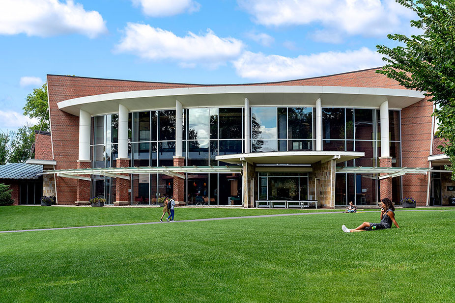
Campus
With award-winning dining and dorms, the perfect college town, and 1,000 acres of
natural beauty – there’s a lot of ground to cover. But, like any home, our campus
is both a comfortable place to return to and a launchpad for exploring the world around
you.
Community
Welcome to a place thriving with individual expressions, and a unique setting where
they all work together. With hundreds of student-run clubs, including dozens of sustainability,
diversity, health, and wellness programs — you’re invited to explore your unexpected.
Show and tell
Student stories
It's something we hear often: Students come to Skidmore to "do both." They want to explore multiple passions – science and music, performance and politics. They seek the freedom, encouragement, and support to explore, mix, match, add, and create. We believe we offer all of this and more ... but we'll let them show and tell you themselves.
Skidmore Facts
$56,700
Average First-year Skidmore Grant
44
Majors
100+
Clubs and Organizations
8:1
Student-faculty ratio